Best Website Designs and How Much the Website Design Costs in 2021
written by Paul Belogour. Jan 21, 2021
In 2021 the unique and attractive website design becomes crucial as never before. Businesses all over the world are forced to close their brick and mortar branches and shift online. The rivalry on the internet is fierce these days. No wonder everyone is eager to know what trends in website design are going to dominate in 2021 and what the average cost of website design is for small and large businesses. In this post, we discuss some most beautiful and unique website designs and calculate how much it cost to design a beautiful website in 2021. Here we go!
Top 6 best website designs
To compile this list of the most appealing and attractive website designs, we chose only custom designed and developed websites. Although templates and website builders can offer you some aesthetic solutions, websites built on top of some ready-made solutions will always have an ordinary look. This is why we're going to discuss only the websites that are designed and developed from scratch. A lot of the websites we’ve chosen for our review won the Awwward price for the best website designs.
Hello Monday
Hello Monday is a creative studio that offers its branding services. The website design is unique and very straightforward in terms of its purpose ‒ introducing visitors to the team of creators who think out of the box.
The first thing that a visitor sees when gets to the site are animated doodles that make visitors forget about everything and watch the animation till the end. 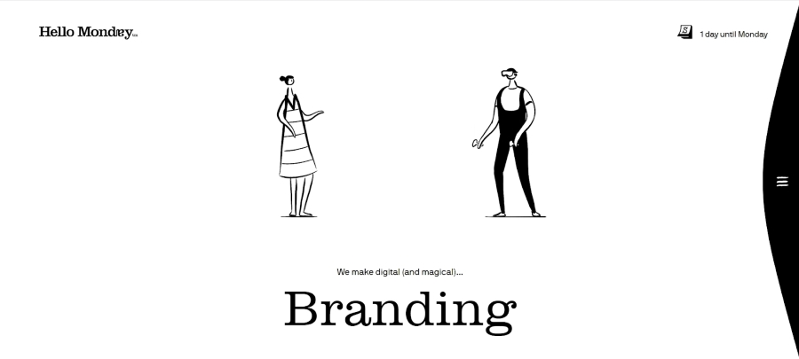
Another thing that catches the eye of a visitor is the calendar in the right corner that shows days till Monday (the website is called Hello Monday, remember?).
When visitors scroll down, they can see the works of the company. The fun part here is that the cursor when hovering over cards with the company's case studies, makes these cards move. At the same time, the cursor turns into a funny face that is also animated.
However, it’s not only the unique aesthetic experience that a visitor gets once opening this web portal. The UX is also well thought out. Navigation through the site is clear and intuitive yet very unusual at the same time. For instance, when users go to a particular design solution, they get to another screen. To get back to the home screen, users need to click on X in the upper-left corner. 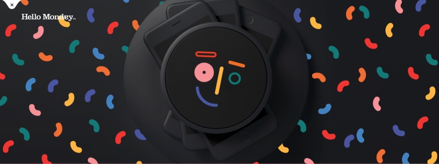
etq
Etq is a luxury shoe brand. The online store that the company launched reflects the premium quality of the brand and its high status. 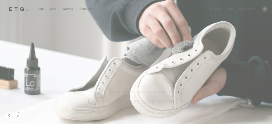
The website design is minimalistic and very laconic. It mainly uses white and light-gray colors in order to attract all users’ attention to the items sold via the website.
The web store may seem to be non-functional because such common features as filters and search are hidden and don’t overshadow half the screen as it usually happens to the online stores. Nevertheless, the website has all these features at its disposal and allows users to quickly and efficiently find the pair of shoes they need.
The filtering and searching features are laconically displayed in the upper-left corner and can be easily found if necessary.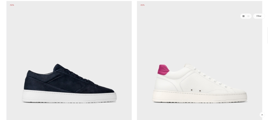
Aquest
Aquest is another company that lures customers with the unique appearance of its web portal. The site uses a lot of animation and looks like you look at it through the water. 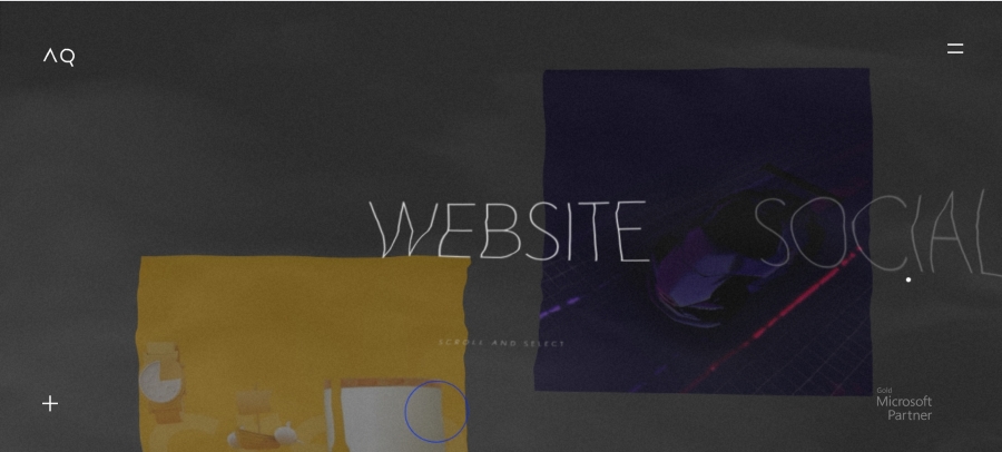
Another element that attracts users’ attention is unusual scrolling. When users scroll down, cards that are located on the left side of the screen move down while cards from the right go up.
It’s also worth mentioning the use of the fonts in the website design that, on some screen, can occupy the majority of free space. 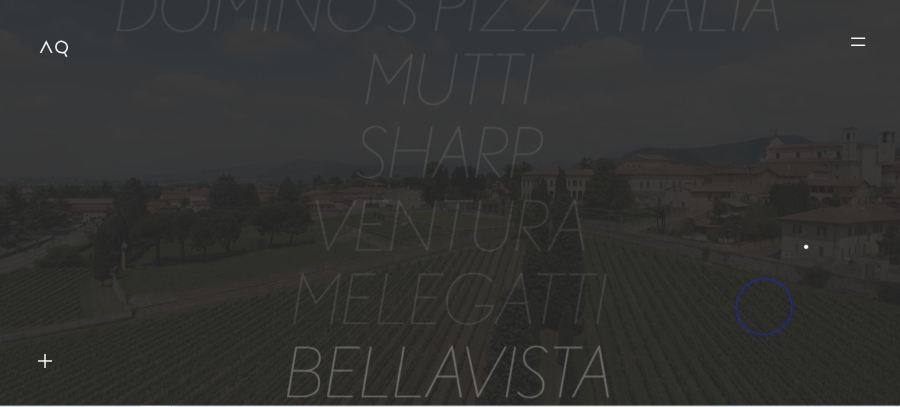
Woven magazine
Woven magazine is a popular magazine edition that compares favorably with other similar websites. The website is an online store that allows users to purchase published magazines.
The home page of the website looks very neat and minimalistic yet attracts the viewers with the unique photography and unusual fonts. 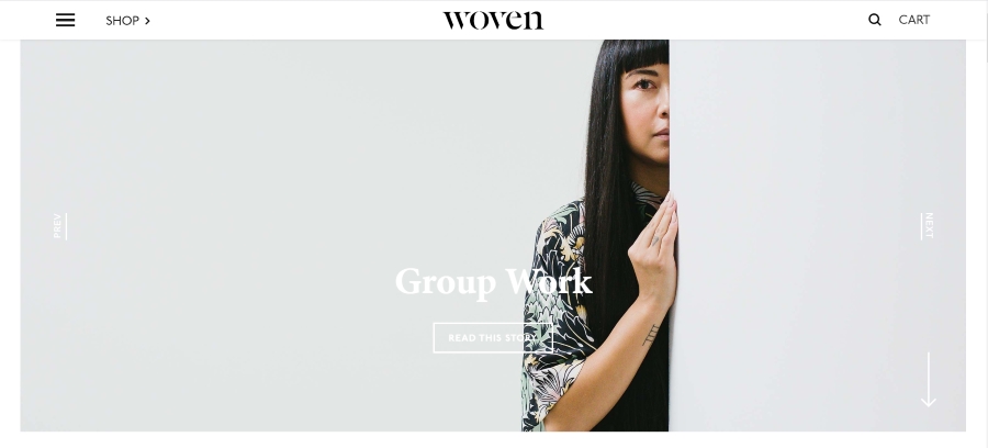
It's worth mentioning that the main attraction of the site is the photos of magazines that are presented in the best possible way to persuade visitors to buy a copy of the magazine. 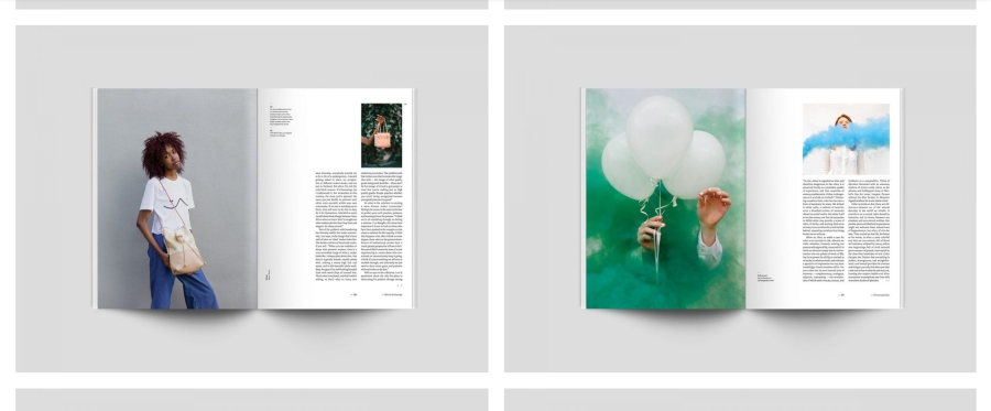
To attract even more visitors and build a community of like minders, the website offers visitors to read some stories that are freely available on the site. These stories look like pages of a real magazine offering a bunch of professional images and fonts that are more common to be used for printed editions. 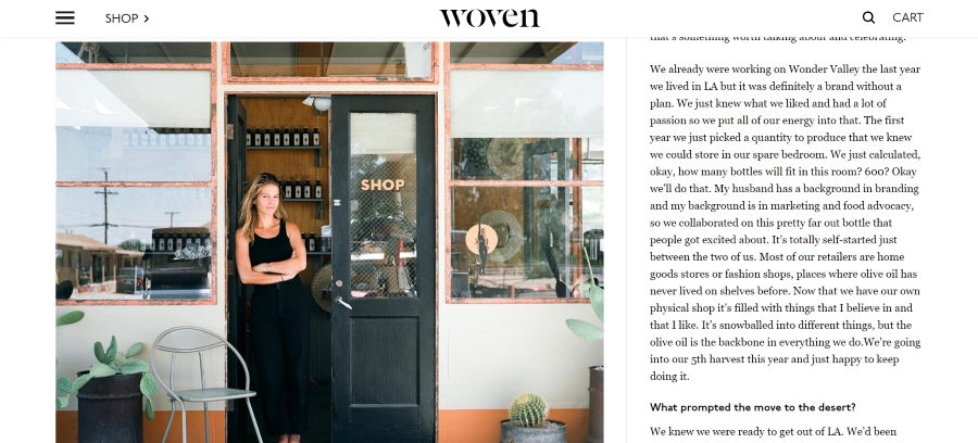
In general, the website managed to create a one of a kind experience that visitors can feel both when touching a real magazine and using a website.
Paperplanes
Paperplanes is an extravagant website that is meant to be used on Android devices. When opened from a PC, the homepage is non-functional and only shows the animation of the planet and paper planes that fly around. 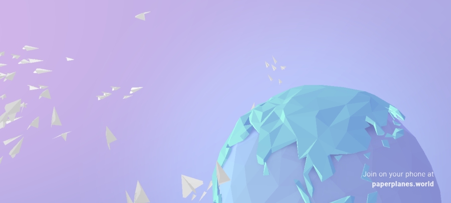
However, if users open the website on a mobile device, they have a chance to create a paper plane with a stamp of his or her country, fold the paper in the form of a plane, and through it as if users tried to through a real paper plane.
As well as throw, users can also “catch” someone’s plane, unfold it, check where the plane has been (viewing the stamps from other users), add a stamp of his or her country to it, and throw it to the world.
The website is far from being functional or useful. Perhaps, it was created by a dreamer who loved to play with paper planes in childhood. Despite its inefficiency, the site is quite unique and entertaining.
Vermont Maple Syrup
Vermont Maple Syrup is an online web store designed by the BUT team. The store was created in order to help the local community of Vermont to prosper and is used to sell the finest maple syrup from local producers.
The home page of the website shows the beauty of Vermont nature. The heading and subheading allow visitors to understand the main idea and purpose of the website. 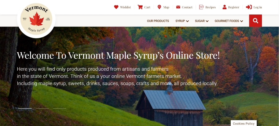
The website design isn’t overloaded with elements, it's consistent and servers its purpose perfectly. The web store is easy to navigate. All the call-to-action buttons are bright red and attract users’ attention immediately. The site was designed using the best practices for creating online stores. 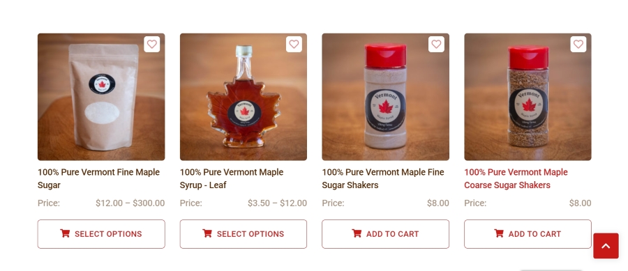
The parting thought
From the examples above, we can conclude that the websites created from scratch are much more appealing, interactive, and unforgettable. Users who once visited these websites get a unique experience and then feel an emotional link to the brand that impressed them.
The only benefit that the templated solutions can offer you is the time saved on the creation of your product. They also claim to be much cheaper than the development from scratch. Nevertheless, it’s a trick they use to lure more inexperienced customers. The thing is, when creating your solution with a builder and using a ready-made theme for it, you don’t get a website, you rent it. The cost of a theme is the monthly fee clients pay to use it.
With custom development and design, you get YOUR software product that belongs only to you. More than that, you get a chance to create a unique solution tailored to your brand spirit, business type, and target audience’s needs.
However, if you are concerned about the website design cost, we can assure you that in the long run, a templated website will cost you even more than a unique website that translates your company’s brand to the world. How much does website design cost? Let’s find out!
How much does web design cost?
To find out the exact web design cost, you need to take into account such aspects as the initial design you want to implement, the feature list of your website, the hourly rate of a software development team you hire, and its composition.
The majority of clients contact from 5 to 15 software design and development teams to find out how much it costs to design a website. In most cases, they need to wait at least a month to get a rough time and money estimate.
However, at Boston Unisoft Technologies, we’ve already calculated the average cost of website design for small, medium, or large businesses.
If you hire us to handle your landing page development and design, it'll cost you $999. For the promo page with 8 ‒ 16 pages, we charge $1,999. In case you want to create a corporate website with 25 ‒ 75 pages, we can do it for $6,999. For the e-commerce site that hosts from 100 to 1000 products, we charge $4,999. It’s also worth mentioning that the price includes hosting and 24/6 technical support from our best specialists.
If you are ready to create your one of a kind website and surpass all your rivals? Contact our team, and let's get started!