
Animation in Mobile App
Every app developer craves designs that appeal to the users and improve their experience. One proven way to achieve this is by integrating animations into mobile apps.
Animation adds visual feedback that notifies mobile app users about ongoing interactions between interface elements. However, if you misuse animations as a mobile app developer, you will distract users and deprive them of the exciting experience you attempted to foster in the first place.

In this article, we unravel the fundamental goals of motion design, different types of animation, and the underlying principles of animation design. We also inform you of points to consider when implementing mobile app animations.
Fundamental goals of motion design.
Motion design in-app plays a critical role in user experience and user interface. These include:
Enhanced user experience
Users tend to develop a personal affinity for apps that provide a tailored experience. Many mobile applications out there are too similar and boring. Integrating motion design into your app will help you stand out as a mobile app designer. Besides, it’s a perfect chance to register your brand identity into the subconscious minds of your users through in-app animations that deliver exciting experiences. Do this seamlessly and watch your user retention skyrocket.
Improved user engagement
Social media interactions, such as likes and shares, are good metrics for brand performance. However, when you integrate animations in mobile apps, you will optimize user engagement and social interaction. Although this might not be a direct measure of your app’s success, users tend to be more loyal to apps that give them the best experiences than competitors that don’t.
Optimized interactive navigation
Human beings have short attention spans and easily get bored. However, users who understand how different interface elements connect tend to be more actively involved in the app transitioning. For instance, during load time, especially with poor connection, they might casually switch to another app rather than wait. You can use animations to engage them while drawing their attention to key features and elements of your app. All the motion design goals work for IOS, Android, and web apps interface.
Types of animations and uniqueness of their implementation
Animation on mobile comes in different forms. We review the top ones here:
-
Structure and Navigation
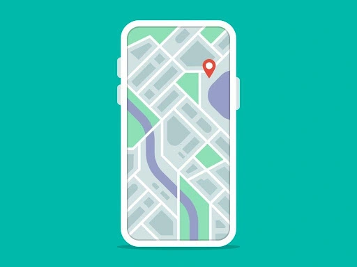
As mobile apps become more intuitive, so do their navigation complexities. As a designer, your primary responsibility is to make your app’s structure and navigation as simple as possible. For example, you can guide your app users on how to navigate to a particular location through navigation animation on mobile.
-
Progress animation
Have you ever used a mobile app and had to wait longer than anticipated without knowing what was happening? Every mobile app developer strives to develop an app that works with the speed of light. However, sometimes, some heavy interaction takes longer. With progress animation, you can keep the users abreast of what’s going on by displaying the progress level of their activities. Also, through progress animation for mobile, users gain confidence knowing that their wait is not in vain, countering the negative effects of the waiting time.
The best way to let users know the result of any action they perform on your app is to let them see every process, which is where progress animation lends a hand. Different animations should accompany every process on your app. For example, when downloading data, you can integrate the progress level bar with a thumb-up upon completion.
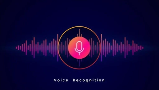
Here is an example of a progress animation; this animation indicates to the user that the recording is in progress.
-
Scroll animation
Scrolling is one of the animations all users are used to in both web and mobile interfaces. It complements interactive designs and puts users in control by informing them of the next process to follow on the app. Scrolling animation can be vertical and horizontal or left and right. Animated scrolling can also be a scroll drawing, one-page scrolling, background changes, and many more.

-
Feedback animation
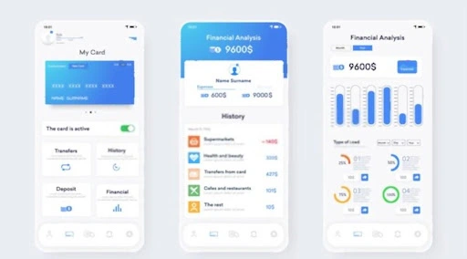
The mobile device world has gradually transitioned from physical buttons to screen touch. Users no longer have that feeling of resistance from pressing an actual button. However, with feedback animation, you can still incorporate animation buttons, ticks, switches, and toggles that will inform the users whether a particular action is successful or not. This type of animation keeps the communication line active between your app and its users. For instance, if you design a mobile banking app, you can leverage transitioning between screens, showing different changes in color and interface to notify your users when their transaction is successful.
-
Fun animation
One of the smart ways to add gamification to an app while promoting your brand is through fun animation. As a designer, you can integrate fun animation into a mobile app when you want users to develop a special interest in your product. However, fun animation can lose its purpose when you apply it carelessly because it tends to complicate the development of an app. But using it creatively contributes to your app’s user experience by appealing to users’ emotions. Also, users will enjoy the user interface because it’s easy and fun to use.
-
Loading animation
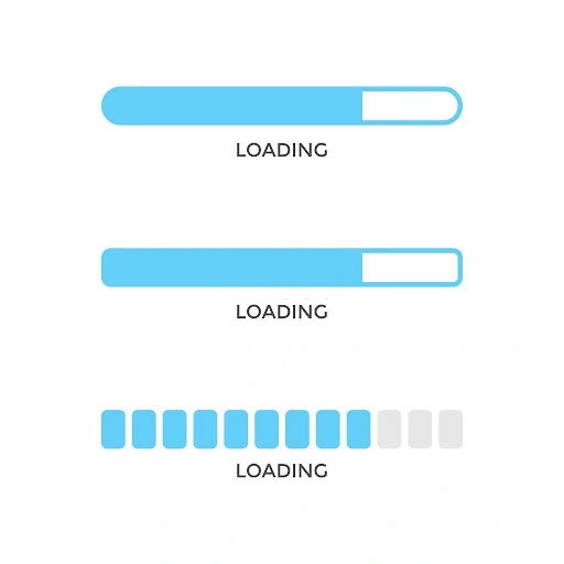
Loading animation informs users of the loading process. It’s a subdivision of progress animation. One example of this type of animation is pull-to-refresh animation; pulling down the tab will notify a user of the loading process.
-
Function change
This animation notifies users how a function element changes when they engage it. You can integrate function changes when you want users to implement specific changes. They often come with switches, buttons, toggles, and various small design elements.
Principles of animation design
Let’s examine the fundamental principles that can make successful animation designs.
Timing
Timing is one of the most important factors when designing an animation; every object needs time to move and slow down. Try to use curves to make your object move freely to save time.
Ease-in/Ease-out
This principle is derived from physical objects; for example, an object can’t start moving immediately. All objects require time to accelerate and come back to inertia. When you design animation following the ease-in and ease-out principle, it results in a real movement pattern.
Anticipation
The anticipation principle should be applied to the animation element. This will make the user predict that something is about to happen. One way to accomplish the anticipation principle is to utilize the ease-in and ease-out principle. This will indicate to your users that something is coming up.
Material
Make them understand what your element entails. Is it bulky or light, rigid or flexible? Implementing material principle into your animation designs will give your users insights into how your user interface element engages with each other.
Trajectory of movement
Trajectory defines movement dynamics. Ordinarily, inanimate objects have a linear trajectory, but the animated object has a less linear trajectory. That is why deciding the motion animation you want to give your user interface is crucial, as well as sticking to it.
Exaggeration
3D animation designers often use this principle. It is easy to use because the goal of the principle is to exaggerate an action to your user. Exaggeration principle attracts user attention to the core features of a mobile app.
Follow-through and overlapping
Follow-through and overlapping work closely. Follow-through means the termination of the action. Overlapping means that another action starts before the first action is completed. This keeps the user in mind that their actions are not being delayed. This principle aims to inform users about the effect of the action they perform.
Secondary action
This principle is closely related to the follow-through and overlapping principle.
Animation design can be accompanied by secondary action, making designs unique and user-friendly.
Focus on animation
This principle is commonly used in animation for mobiles. It makes users focus on a particular part of the screen. Focus on animation principle is used when a user interface has a lot of details and elements. It can also be utilized when there are new changes on a mobile app.
Rhythm
The principle of rhythm in animation performs similar functions as in music and dance. Rhythm makes animation design look natural and is widely utilized on mobile banking apps to welcome users.
Points to consider when implementing mobile app animation.
These are some points to consider implementing animation for mobile:
- To make your brand or product stand out, strive for a unique and natural-looking animation that illustrates a real-world trajectory.
- Discover who your target personas are and design your mobile app user interface to answer their questions.
- Understand your user’s goal.
- Make sure your animation design solves a problem and also provides solutions.
- Reach out to developers at every stage of your project; this will help you know the animation software that best suits your project.
Hire a mobile app developer from Boston UniSoft
Mobile app animations are game-changers in improving user experience and enhancing the user interface. Your goal is to decide the best type of mobile animation for your app and the underlying principle for choosing them. However, before you can incorporate mobile app animation in your app, you need a software and mobile app development company that you can trust to integrate your app development concept and ideas to provide solutions to your customer needs. At Boston UniSoft, we boast a reputable team of IT professionals and software and mobile developers with years of experience in FinTech and payment systems.
Feel free to check our mobile app portfolio to see our recently completed app development projects.
Kindly get in touch with our team to discuss your app needs.